Understanding digital customer journeys with actionable data
You know you want a session replay tool, but you’re not sure if you need a tool that presents aggregated data with a heatmap or a clickmap. What’s the difference anyway? Don’t they all tell you the same thing?
Visual representations of digital customer journeys
When thinking about digital customer journeys, it is hard to know which tools will give you the most actionable data. Do you need heatmaps that show you where people move their mouse (or where they happen to leave it when they are interrupted by a chatty co-worker) or do you need to see which elements they actually click when they visit your website or use your mobile app?
You’ve probably seen heatmaps, with their multi-colored blobs that are reminiscent of thermal imaging. They paint a nice picture, and it can be fun to see where people tend to hover, how much of the screen they navigate before making decisions, and which parts of your website are getting the most attention.
As a tool, heatmaps were good approximations of activity when websites were accessed primarily from desktops and full-sized laptops, and when digital customer journeys were fairly straightforward. Now that we’re in the age of multitudinous devices, responsive websites, and mobile applications, heatmaps leave a lot to be desired.
Visual analytics for dynamic sites and mobile apps
Heatmaps are static, which means they do not work well with dynamic websites that have changing content, pop-ups, and other moving or temporary features on a page. The picture you get from a heatmap does not distinguish between the various elements on your site because the map is based on where the mouse is in relation to the size of the screen, not where it is in relation to your elements.
Heatmaps also require a lot of configuration to create a map of your website, and the configuration has to be updated each time your website changes. If you try to keep your website responsive to the changing needs and wants of customers, those changes add up to a lot of additional work in re-configuring your heatmaps.
If heatmaps have so many limitations, you may be wondering what you can use to visualize and understand digital customer journeys. For an aggregated visual of customer journeys that does not care about the size of your customers’ screens and does not require laborious setup and configuration, clickmaps are the answer.
Clickmaps tell you exactly which element on your website or app was clicked, rather than giving you a vague “temperature” gauge for the part of the user’s screen where mousing and clicking occurred. Because clickmaps focus on elements on your website, they can aggregate data across every screen size without any discrepancies. Your “buy” button is always your “buy” button, even if it is in a different location on each screen.
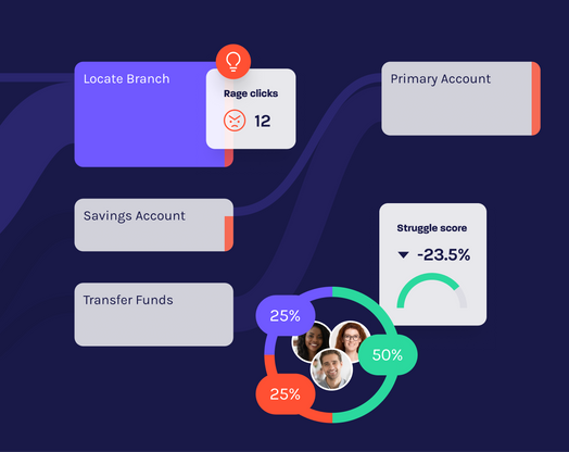
With click analytics and deep behavioral analytics, you can tell where your customers are really clicking, and with session replay tools you can observe how your customers interact with your website or app. This data allows you to make important decisions about your website to optimize your customer journeys, minimize frustration, and close more deals.
Plus, there is a lot less configuration necessary with clickmaps. Your maps change as your website changes, without the need for time-consuming re-configurations every time you move or change an element. Tools like Glassbox give you automatic insights so you can focus on the important parts of your day instead of wasting time trying to train your analytics tools how to do their jobs.


