Form analytics: Uncovering actionable insights for form optimization
Eighty-one percent of website visitors abandon an online form after beginning to fill it out. Whether a checkout form, registration or anything in between, this vital conversion method is one of the largest sources of struggle for users. Form analytics is an important aspect of conversion rate optimization (CRO) that can help turn desertion into deals.
Key takeaways
Form analytics play an essential role in optimizing forms and increasing conversions
The main causes of form abandonment are identified using form analytics
There are proven methods that can grow submission rates and result in conversions
What is form analytics?
Form analytics is an important part of conversion rate optimization (CRO) and helps analyze a visitor’s interactions with a web or mobile form to determine its effectiveness in the customer journey. These analytics include every move the visitor makes while filling out the form, such as time on the form, movement tracking, abandonment rate, hesitation time, struggles and other key data.
The data from form analytics is invaluable. Without it, there’s no way to understand why customers are abandoning your form, making it impossible to optimize your forms to reduce abandonment.
Why do website visitors abandon your forms?
There are common reasons why visitors abandon website forms. Some of the most common reasons are that the forms are:
Asking for too much information. People come to your site or app to get a task done and move on: if it’s long and unwieldy, too many fields marked “required,” or other inconveniences, they’ll leave.
Requesting irrelevant information. Similarly, asking a visitor to provide data that has little or nothing to do with the form or product, or it just seems out of context, will result in abandonment.
Having security concerns. Personal information, such as phone number, credit card number or other sensitive data, requires a visitor’s trust. Without the right logos, privacy policies, data encryption and other trust signals, fears overtake form completion.
The layout is complex or unappealing. It’s easy to lose a visitor when a form doesn’t integrate UX best practices and has a clunky layout, unclear instructions, or is difficult to navigate.
It isn’t mobile-friendly. Filling out a form is already a chore, and increases dramatically for mobile. Reading small text, fumbling for the right gestures or other headache-inducing actions will push the person out of the app.
Not aligned with the customer journey stage: During the discovery phase, for instance, a form will be short. Later in the journey, it’s expected that a form will have more questions. If the visitor thinks the form isn’t fitting with the correct stage, they’ll leave.
There are technical issues with elements of the form causing friction and therefore abandonment. Having the ability to identify technical issues as they occur enables you to reduce the impact of the issues and prevent further abandons.
Keep these form abandonment stats in mind when you’re optimizing an existing form or designing a new form:
29% of people report security reasons as one of the main concerns when it comes to form abandonment, followed by form length (27%)
Asking for a phone number reduces form conversion rates by up to 5%, followed by street address (4%), a person’s age (3%) and city and state (2%)
23% of people will not fill out your checkout form if you require them to create a user account
More than 67% of site visitors will abandon your form forever if they encounter any complications
The importance of analyzing and optimizing the performance of your forms
All forms can benefit from form analytics–at the beginning of the relationship with the contact form to the cart at the purchase stage, and everyone in-between.
These are just some of the questions form analytics can answer:
Should this field be optional or removed?
Is this form at the right part of the customer journey?
Why are most visitors leaving at the same field in this form?
Should we A/B test a trust logo to see if it affects the form submission rate?
Why is this form performing better with one customer segment but not another?
Here are three crucial impacts form analytics have on the conversion funnel. They can:
Reduce abandonment: As noted, form abandonment is a huge issue on all websites and apps. Analyzing where the visitor dropped in the form can provide important clues and lead to insights that can help increase submissions.
Decrease incomplete forms: Depending on the way a form is set up, partially completed forms can still be submitted. Understanding which fields always get skipped or a text field that wasn’t clear can identify areas for improvement or removal.
Increase lead conversion: Ultimately, the goal of a form is to move the visitor to a conversion of some sort–attending an event, downloading an eBook or buying a product. Form analytics is an integral part of conversion rate optimization.
Getting started: Using form analytics to optimize your forms
Form analytics data can be used to make data-driven, well-informed decisions instead of relying on guesswork. The data is critical to understanding why customers are abandoning your form and can help accelerate testing, iterations and improvements.
A key component of form analytics is to view each form as a part of the conversion funnel. Every form will require your visitor’s time and energy and they’ll go through that assessment each time they encounter one on your website or app.
Form optimization pyramid
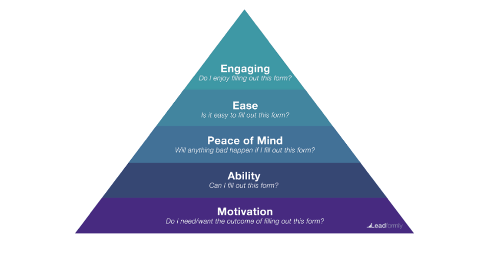
Visitors ask themselves a set of questions when filling out a form. Source
Four proven ways to optimize form conversions using form analytics data
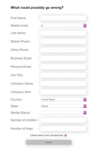
1. Eliminate unnecessary fields
A great place to start is to tighten up your form, top to bottom. More than 25% of people don’t fill out a form because it’s too long. The more you can minimize the amount of work your user has to do, the more likely they’ll fill out the form.
The solution:
Go through your form with a fine tooth comb and remove any required fields that you don’t really need information for. Side benefit: these fields could also be causing user validation errors.
Consider cutting optional fields, which can reduce one or more decision points. Typically, a low percentage of visitors complete optional fields, so check your form analytics data. If the completion rate for an optional field is low, and you don’t really need the information, eliminate the field for a better user experience. With data analytics tools to measure each field performance, you can leverage insights to make improvements that will increase conversions.
2. Label all fields as required or optional
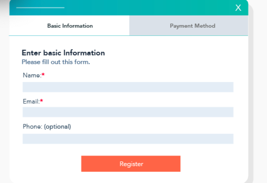
Not all fields are created equal, so don’t treat them that way. Approach each field from your users’ point of view. For instance, a whopping 37% of people will leave a form that requests their phone number, but when it’s optional, completions double.
The solution:
Mark each field as required or optional so visitors don’t have to guess what an unmarked field means (and risk that they fill it out incorrectly).
Conversely, use more “optional” fields where possible. Users want to know they have control and freedom over their personal data.
Tell your users how their data will be used. For fields such as phone number, visitors may be reluctant to provide this information if they are concerned about what will happen with the data. The addition of some microcopy above the field or a tooltip that explains how their data will be used (e.g. a mobile number may be used for assisting with account recovery) can help ease these concerns and provide reassurance.
3. Take a mobile-first approach
If visitors are going to fill out a form, the vast majority tackle it on a desktop. Only 3% of visitors finish a form on mobile. Since most web traffic these days occurs on mobile devices, to increase your chances that visitors will complete the form, ensure it’s optimized for smaller screens or dynamic. Also consider which type of device is used since it can affect form navigation flow, and have a measurable impact on the form performance.
The solution:
Make it easy and efficient for users to fill out the form by presenting the keyboard for each field that matches the required task. For example, if a user activates the email address field on mobile, present the email keyboard with the “@” symbol handy and autocorrect and auto-capitalization turned off.
Use radio buttons, specifically styled for mobile instead of drop-down menus where possible. Mobile drop-downs hide options and require two taps. Radio buttons allow all options to be seen with just one tap.
Use a single-column format, which keeps the flow of the column in one direction, top to bottom, and doesn’t introduce any confusion about where they are on the form.
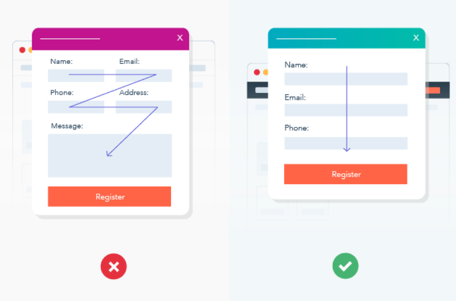
4. Display error messages and validation in-line
Visitors want to know in real time how they’re progressing through a form. Seeing all errors at once, only after hitting “submit,” can be overwhelming and requires backtracking to inspect each field.
The solution:
Review your form analytics data and look for questions or fields in your form that cause a disproportionately high number of users to struggle. Review heatmaps and session replays to get an idea of the root cause. Can the question be rephrased, made optional or eliminated to create a better experience?
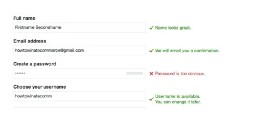
Display field-level error messages in-line. If a visitor leaves a required field blank or inputs an invalid entry into a required field, they’ll immediately know and can correct it before scrolling on.
Provide a clear, concise reason for the error (invalid date, empty field, coupon code no longer valid, etc.) and make it easy to view.
Display confirmation of a correct field completion as a green checkmark or another visible indicator. For instance, after a user creates a valid unique username, show a green checkmark so it’s clear they can proceed to the next step.
Striking the right balance between collecting information and delivering a great user experience can be challenging. Leveraging form analytics to do a thorough and thoughtful review of your form fields will deliver a frictionless digital journey and maximize conversion rates.
How Glassbox can help
Glassbox provides the data you need to understand why customers are abandoning your forms, allowing you to deliver frictionless customer journeys and maximize conversion rates. Learn more by visiting glassbox.com.
Form analytics FAQs
What are form analytics?
Form analytics–an important part of conversion rate optimization–is the practice of analyzing all of a visitor’s interactions with web and/or mobile forms to evaluate pain points, what’s working well and other insights. Insights can be used to optimize forms, increasing customer engagement and conversion.
Why are form analytics important?
Form analytics are an integral part of understanding the success (or failure) of the customer journey. They are key in driving a prospect forward in the digital funnel. Optimizing forms can lead to higher conversion rates and increased loyalty.
What are the most common problems with forms?
There are many ways to turn off a potential customer. The biggest issue by far is abandonment. This is typically caused by forms that are too long, ask for irrelevant information, don’t provide trust signals, are in confusing layouts and aren’t mobile-friendly.
What are the best ways to improve forms?
Each form should match the stage of the customer journey and have a clear, functional purpose. Forms should be as brief as possible (while collecting necessary data), few or no optional questions, clearly display trust signals and contain smart auto-select features.


